Book Categories:

Whether on physical retail shelves or e-commerce platforms, the beauty packaging design always influences consumer purchasing decisions—often in subtle, subconscious ways. Without considering brand influence, when consumers are faced with products of similar price and functionality, packaging design often becomes the deciding factor that tips the scales.
Excellent beauty packaging design not only drives sales conversion directly, but also helps build brand awareness and consumer loyalty. However, truly great beauty packaging design does not necessarily depend on uniqueness or extravagance—it lies in whether it aligns with consumers’ psychological expectations. It is precisely in that moment “when it is seen” that packaging completes its transition from visual attraction to purchase motivation.
Today, we will start from several common consumer psychology perspectives and derive 10 highly compelling beauty packaging design strategies—exploring how these brands use packaging to capture attention in the market and leave a lasting impression on consumers. We believe that after reviewing these cases, you will be better equipped to understand your consumers’ true needs when planning your product packaging, and make more targeted design decisions accordingly.
1. Reassurance of Safety
Product safety is not a concern exclusive to food consumers—when purchasing beauty products, consumers equally care about safety, ingredient naturalness, and overall quality. It can be said that the need for safety reassurance is one of the most fundamental and universal consumer psychology drivers, underlying nearly every purchasing decision a consumer makes.
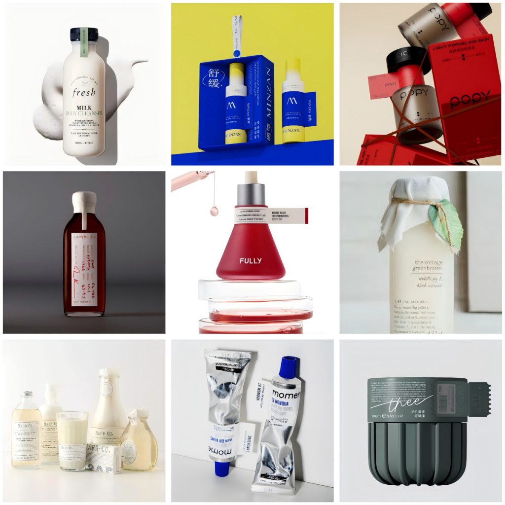
If a brand wishes to convey this sense of safety through packaging—particularly for natural handmade products or organic lines that emphasize natural ingredients—the Law of Closure from Gestalt psychology can be skillfully applied in beauty packaging design. This principle suggests that when objects are placed within the same enclosed area, people tend to perceive them as a single, unified whole.
In beauty packaging design, the most common manifestation of the Law of Closure is the tamper-evident seal. When a seal connects the cap and the bottle body, consumers’ visual perception naturally groups them into an inseparable whole. This holistic perception signals that the packaging is intact and has never been opened—reinforcing confidence in the product’s freshness and quality, and reassuring consumers that the product has remained untouched and uncontaminated from the moment of production to their hands.
This application of the closure principle not only enhances the visual integrity of the packaging, but also effectively strengthens consumer trust in product quality. If your brand focuses on natural health-oriented products—such as organic creams with botanical extracts or handmade skincare—applying the Law of Closure in packaging design is a wise choice that combines aesthetic value with psychological persuasion.
2. Sensory Stimulation
If safety reassurance is a typical example of rational consumption, then sensory stimulation is undoubtedly one of the key drivers of emotional purchasing. Today’s beauty packaging design no longer stops at visual impact and aesthetics—it can also trigger consumer associations with taste and touch through visual cues. This design strategy is a concrete application of synesthetic theory in packaging design.
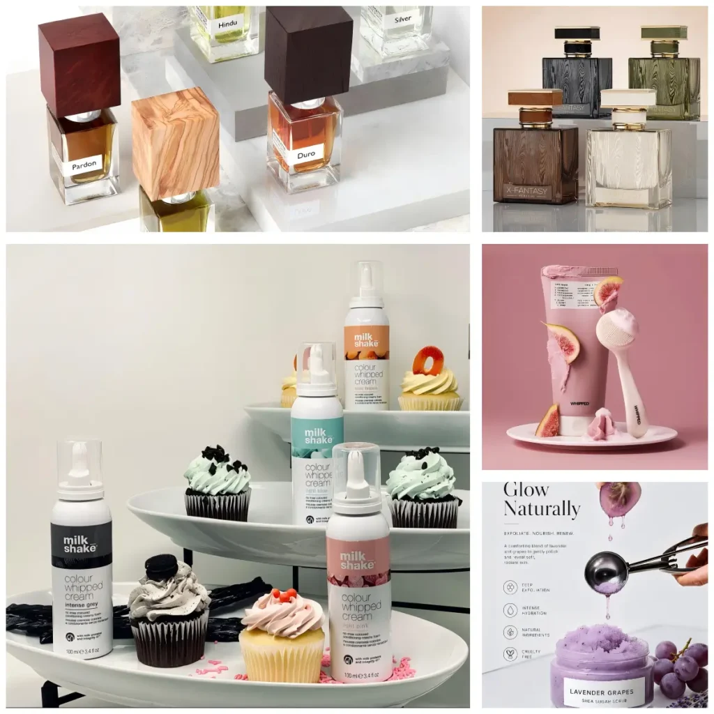
Synesthesia refers to a phenomenon in which one sensory stimulus triggers an associative response in another sensory modality. This theory finds broad and subtle application in beauty packaging design, with one of the most common strategies being the use of visual design to evoke consumer associations with taste, touch, or other sensory experiences—thereby enriching the product’s emotional layers.
In practical application, this strategy often takes the form of packaging colors or shapes that look “delicious”; or through surface finishing processes such as hydrographic transfer and spray coating, surfaces are given textures like wood grain or marble that allow consumers to perceive a warm or premium tactile feel through sight alone.
This element of visual surprise and playfulness itself constitutes a subtle “invitation to purchase,” quietly narrowing the gap between product and consumer.
The significance of synesthetic design in beauty packaging goes far beyond being simply “good-looking”—it transforms the product from a functional container into an experiential medium capable of emotional resonance. When packaging can be “felt” rather than merely “seen,” the connection between brand and consumer becomes more intimate and enduring.
3. Authority Bias
When consumers shop for beauty products with a specific focus on “healing efficacy,” they tend to gravitate toward products that appear more professional and authoritative. Such products often feature packaging with a distinctly clinical aesthetic—a design strategy rooted in the psychological phenomenon known as “authority bias.”
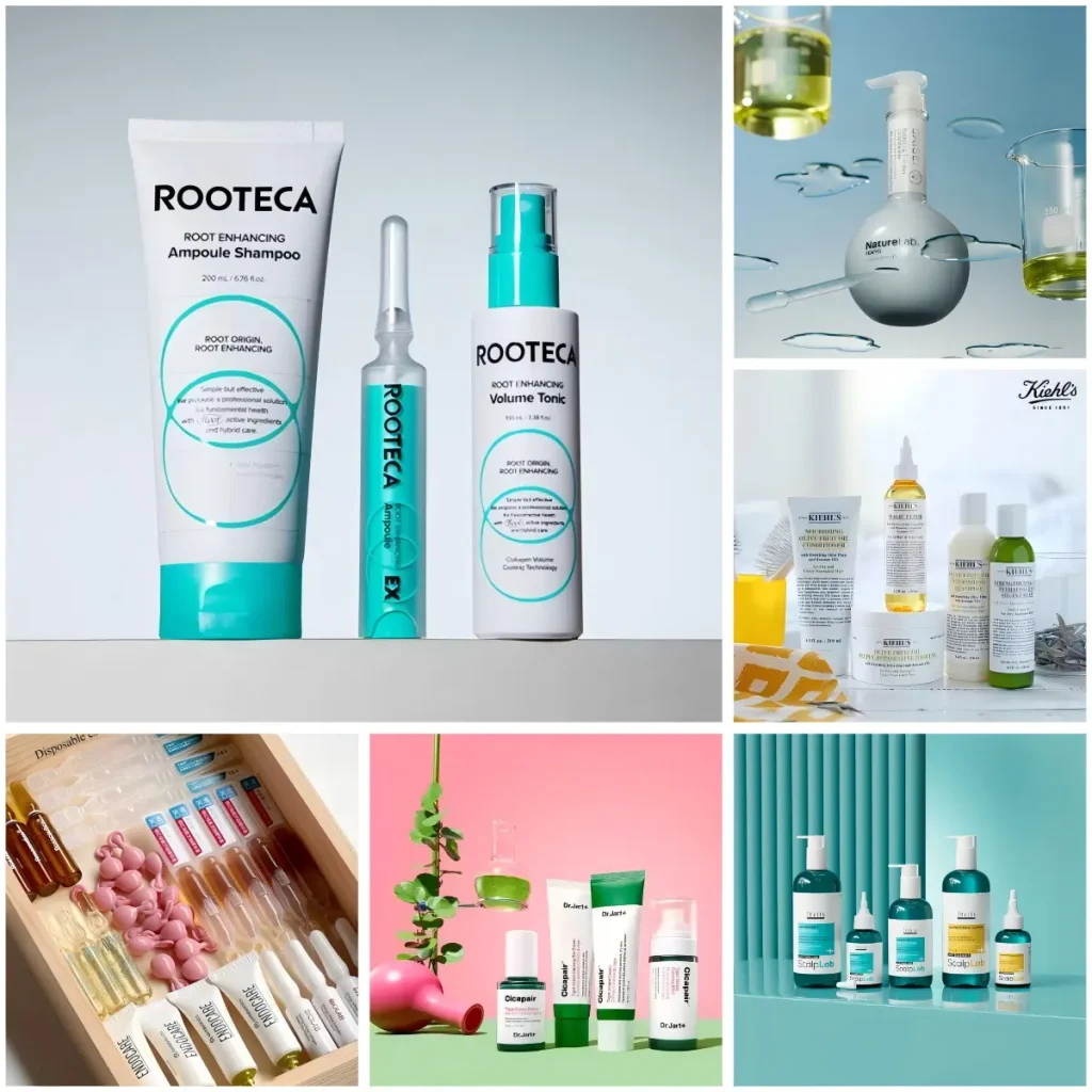
This placebo-effect-driven design strategy manifests in beauty packaging primarily through color schemes and typographic layouts. Minimalist, restrained typography, combined with tones commonly found in clinics—such as green, yellow, and white—conveys a visual language of professionalism, cleanliness, and reliability, much like a doctor’s targeted prescription for a patient. It subtly suggests that the product offers a precise, therapeutic solution. In addition, adopting packaging structures reminiscent of pharmaceutical formats—such as capsule-shaped serums, single-use ampoules, or treatment products with laboratory-inspired bottle designs—can further reinforce this clinical association.
Compared to enlisting a doctor as a brand endorser, this visual strategy of medical-style packaging communicates a sense of reassurance and trust more directly. If your product is positioned to help consumers address specific skin concerns or emphasizes a particular professional efficacy, leveraging this placebo-effect-driven, authority-bias-informed design strategy is certainly worth considering.
4. Baby Schema Design
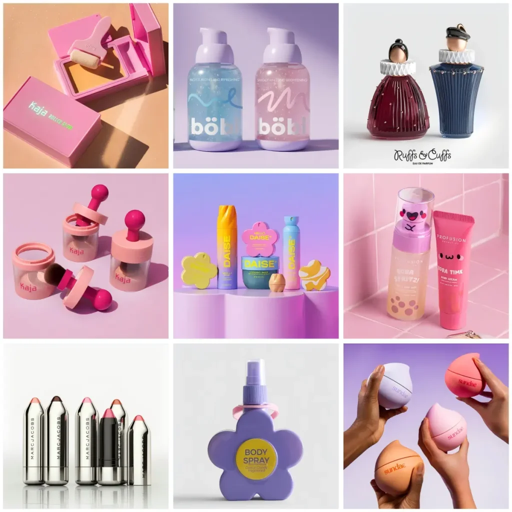
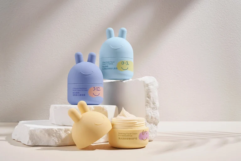
In today’s fast-paced, high-anxiety modern life, young consumers are increasingly turning to product designs that deliver pure, uncomplicated pleasure. Soft, rounded, and gentle visual elements—once considered a design language exclusive to children’s products—are now appearing more frequently in skincare and beauty packaging design, becoming a visual strategy that connects emotion with consumption.
This beauty packaging design trend is backed by a clear psychological foundation. Austrian ethologist Konrad Lorenz’s “baby schema” theory suggests that infantile features—such as round faces, large eyes, and small noses—naturally trigger attention and nurturing instincts in adults. In beauty packaging design, brands are consciously leveraging this mechanism: by mimicking “cute” and “harmless” visual cues, they evoke instinctive liking and closeness in consumers at first sight, lowering psychological barriers and increasing purchase intent.
In terms of concrete design expression, baby schema often takes the form of rounded bottle shapes, soft curves, miniature cartoonish proportions, and bright “dopamine” color palettes. This design language communicates a gentle, lighthearted, and approachable feel, allowing consumers to experience more enjoyment and relaxation during use—and to some extent, helping alleviate daily stress. If your product targets a younger demographic and emphasizes a mild, skin-friendly formulation, baby schema design is a strategic choice that aligns closely with your brand identity.
5. The Completeness Effect and Collecting Motivation
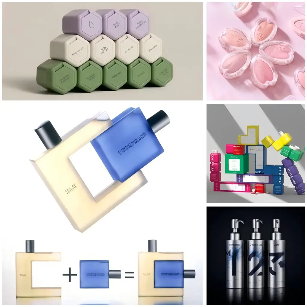
If baby schema design addresses consumers’ desire for “closeness,” then collectible design strategies tap into a deeper psychological mechanism—the instinctive pursuit of “completeness.” This beauty packaging design approach, which embodies the completeness effect, reveals that when people own part of a series, they develop a strong motivation to acquire the remaining items in order to achieve a state of “wholeness.” This phenomenon is particularly common in blind-box purchases, limited-edition sets, and similar scenarios—where consumers often make repeat purchases in order to collect the entire collection.
In beauty product packaging, this collecting-motivation-driven design strategy typically takes two forms: first, by marking products with series numbers or numeric symbols, consumers perceive the first item as “part of a set” and subconsciously establish the goal of “collecting them all.” Second, through interlocking packaging structures, multiple product packages can be combined to form a complete image or shape—so that “collecting them all” is not just a psychological satisfaction, but also becomes a tangible, physical achievement.
Conventional series packaging designs typically adopt a unified structure with color variations to help consumers “distinguish” between products, while also creating a visual sense of “family unity.” However, by adding interconnected design elements or puzzle-like logic on top of the color-coded series, it becomes possible to shift consumer perception from “I want this” to “I need that”—no longer just “I like this one,” but “I’m missing that one.”
This design strategy is particularly well-suited to two scenarios: first, when the product line itself has a strong series identity—such as serums with different efficacy claims or lipsticks and eyeshadow palettes in varied shades—where numbering or interlocking designs can reinforce the sense of series and collectible value. Second, when a brand is in the early stages of product launch and wants to generate buzz through limited editions or debut offerings, encouraging consumers to stay engaged and purchase repeatedly in pursuit of “completing the set.” Furthermore, if your product line offers strong extensibility and your target audience has a high propensity for social sharing, the completeness effect is a design direction well worth exploring.
6. The Birdcage Effect
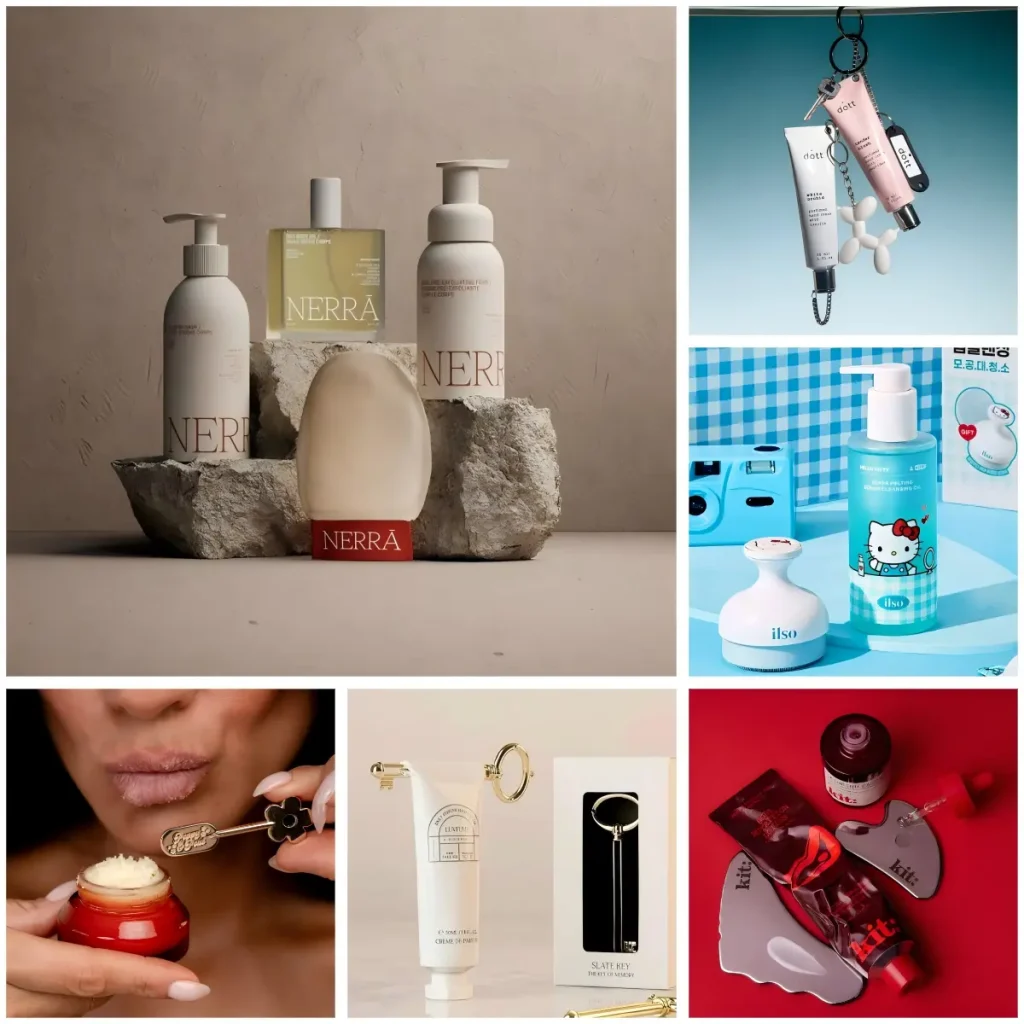
If the completeness effect triggers collecting instincts through visual “series coherence,” then the birdcage effect stimulates purchasing desire through functional “system coherence”—it is not about unified colors or shapes, but about creating a consumer perception of “now that I have A, it seems I need B as well.”
The concept of the birdcage effect originates from a classic psychological phenomenon: when people buy an empty birdcage, they soon feel they “need” to buy a bird to fill it, rather than throwing the cage away. An empty birdcage is perceived as incomplete—it naturally suggests that “a bird should live here.” The same psychological mechanism applies in consumer settings: when a consumer purchases a product or tool, they are inclined to buy complementary items to make the “set” more complete, convenient, or functional.
In beauty packaging design, the birdcage effect typically manifests not through changes in packaging design itself, but through functional connections between the product and its accessories. For example, some brands include or offer a branded spatula alongside their face cream products; hair care lines may come with a massage comb or cleansing tool. As consumers grow accustomed to using these complementary tools, even if the original tool is lost or when using other brands’ products, they tend to purchase the original brand’s “dedicated accessories”—because these tools have become part of their daily skincare routine, and without them, the experience feels incomplete.
Unlike the “series coherence” brought by the completeness effect, the consumer behavior driven by the birdcage effect stems not from numbering or patterns on the packaging, but from a guided usage process that the brand has built for consumers. If your product can be enhanced by certain tools during use, consider bringing these tools into your brand customization scope and launching them alongside the product—making your product no longer just a formula, but a complete skincare regimen.
7. The Barnum Effect
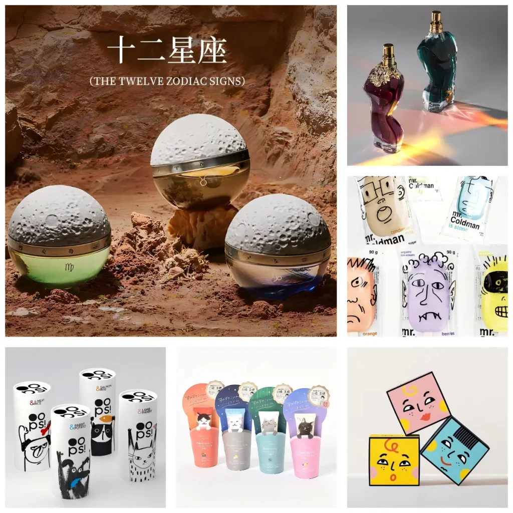
If sensory stimulation can evoke emotional resonance and thereby encourage consumer purchases, then the Barnum effect enables design to convey individual expression—creating resonance by allowing consumers to feel a deep sense of personal alignment. This type of beauty packaging design often leads consumers, at first glance, to think: “This is exactly me.”
The Barnum effect originates from a classic experiment conducted by psychologist Bertram Forer in 1948. He found that people tend to believe in personality descriptions they perceive as personally tailored, even when those descriptions are actually broad and applicable to most individuals. This psychological tendency toward “personalized confirmation” also plays a significant role in consumer behavior—when packaging design resonates with a consumer’s self-perception or personality preferences, purchase intent increases significantly.
In beauty packaging design, the most basic application of the Barnum effect often takes the form of clearly labeled categories, helping consumers quickly find the product that feels right for them. For example, perfumes may be distinguished as masculine or feminine based on gendered visual cues; pet food may use cat or dog imagery to differentiate between cat and dog food. These designs may appear simple, yet they establish an initial sense of belonging between the consumer and the product.
However, to create a deeper resonance with consumers, this type of categorical design strategy needs to go beyond basic labeling and incorporate more tangible visual symbols that convey personality traits. For instance, packaging might feature different cat poses, expressive emojis, diverse character illustrations, or zodiac signs—allowing consumers to not just “choose a product,” but to “choose a persona” that reflects their own identity. They are naturally drawn to the version that aligns with their personal traits, and this choice itself becomes a form of self-expression.
It is worth noting that applying the Barnum effect often means a larger number of SKUs and more complex procurement management. Every additional pattern, emoji, or zodiac variation directly affects order quantities, printing costs, and inventory management. Therefore, when designing this type of strategy, we recommend adopting simple and cost-effective approaches—such as using labels rather than direct printing for multi-version designs, or selecting processes with lower MOQ thresholds for small-batch customization—to strike a practical balance between eliciting resonance and maintaining cost control.
If your product line already caters to a diverse consumer base, and you wish to build a deeper emotional connection through packaging, then a Barnum-effect-driven design strategy is well worth considering. It doesn’t necessarily require complex craftsmanship or expensive materials—yet it has the power to make consumers feel, in the details, that “this was designed for me.”
8. Ritual Design
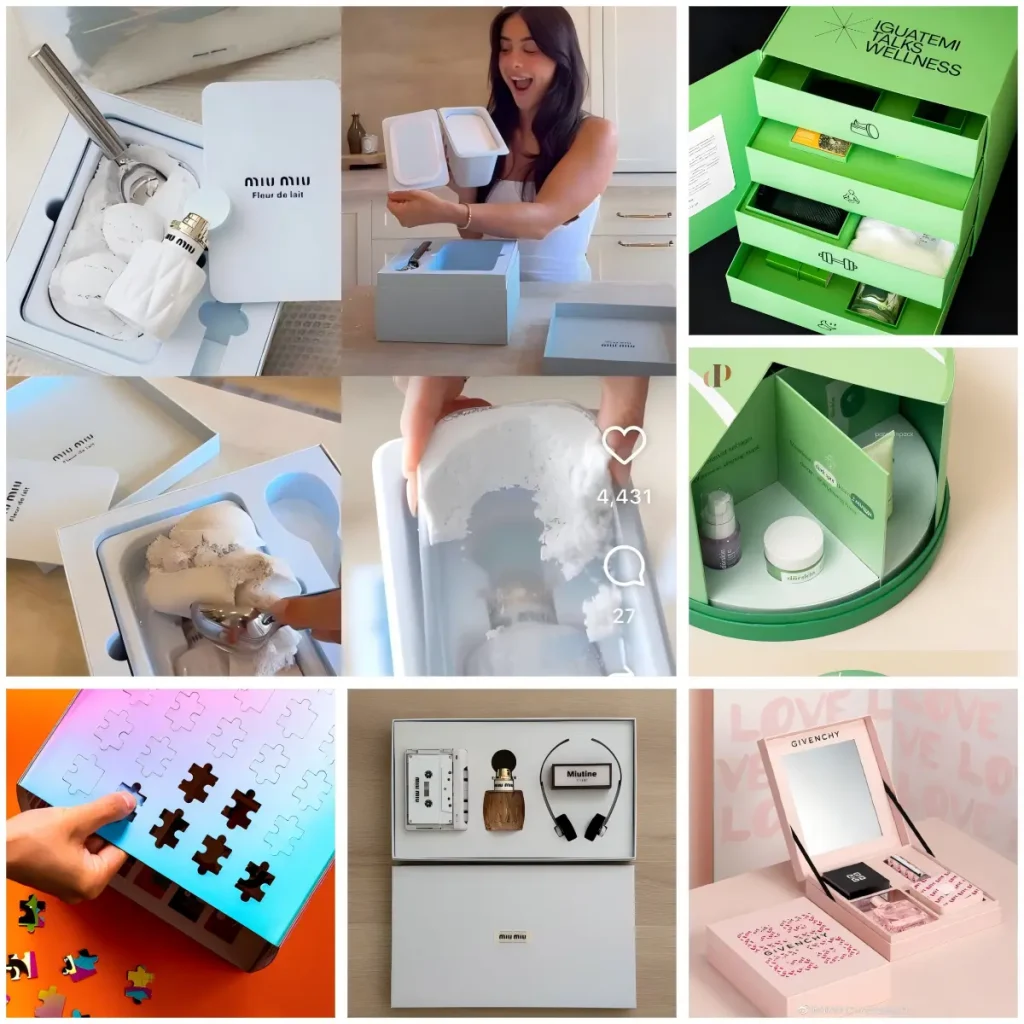
If the Barnum effect builds emotional connections through personality resonance, then ritual design creates emotional value through interactive experience—it transforms the consumer’s journey from “using a product” to “experiencing a ceremony.”
In consumer psychology, ritual is regarded as a psychological mechanism that enhances the meaning and perceived value of an object or act. When people go through a series of orderly, controlled interactions before opening a product, they invest greater anticipation and attention into what they are about to receive. This ritualized unboxing process effectively signals that the product is “worthy of being taken seriously.”
In beauty packaging design, ritual design is not limited to the unboxing experience alone. The product usage process and the closing interaction after opening are also dimensions worth considering. The goal of these interactive moments is to ensure that when consumers follow these guided steps—from purchase to use—they experience not just the efficacy of the product itself, but also a hidden rhythm embedded in the process.
It is worth noting that ritual beauty packaging design does not necessarily equate to complex design or expensive structures. It depends more on a deep understanding of the product’s usage scenarios. Brands need to break down each step of the consumer journey—from receiving the package, opening the packaging, removing the product, starting to use it, and finally closing it—to identify which touchpoints can be enhanced with “actions” or “moments of pause.” By doing so, a once ordinary process is transformed into a rhythmic, anticipated experience. When these interactive moments are thoughtfully designed, a sense of ritual naturally emerges.
If your product targets consumers who value quality of life and emotional experience—or if you wish to encourage photo-taking and social sharing through interactive packaging—then beauty packaging design with ritual is a strategic direction worth considering. It turns packaging from just “a box that holds the product” into an experience that can be told.
9. Raw Aesthetics
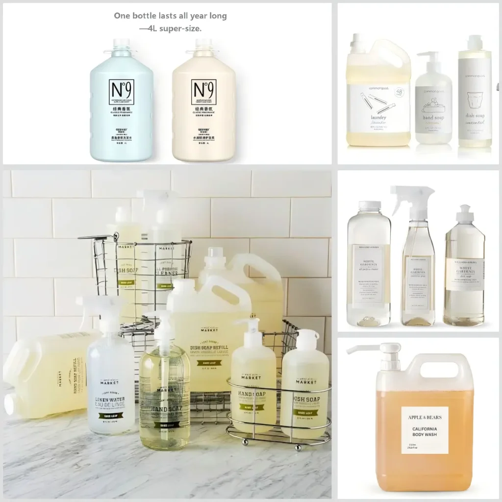
If ritual design adds emotional value through refined interactive experiences, then raw aesthetics takes a deliberately opposite direction within beauty packaging design—it intentionally avoids luxurious, polished, or sophisticated packaging language, presenting itself with an almost “unfinished” look on the shelf, yet precisely this approach wins the trust of a different group of consumers.
This beauty packaging design strategy is rooted in a precise understanding of a specific consumer psychology. While some consumers seek ritual and emotional value, others are more focused on practical utility and value for money. To them, excessive packaging implies unnecessary cost transfer—and raw aesthetics communicates exactly the opposite message: “We didn’t spend extra money on unnecessary packaging.” This honest visual language often resonates more deeply with long-term-oriented consumers.
Raw aesthetic beauty packaging design tends to come in larger capacities, visually conveying a sense of “built to last.” When consumers see this type of packaging, their first thought is not “how beautiful,” but rather “this must be practical.” The capacity itself becomes a value proposition—it signals that the brand is more concerned with whether consumers can use it for a long time and enjoy it consistently, rather than with delivering a one-off visual impact.
Furthermore, this type of beauty packaging design typically avoids complex printing techniques, vibrant colors, or special surface treatments. It often deliberately opts for kraft paper tones, unbleached paper, or monochrome labels. The typography and graphics also lean toward directness—with minimal decoration, often using simple bold or hand-drawn fonts that prioritize clear communication over visual refinement. This design language conveys a clear message: our focus is on the product itself, not on how “pretty” the packaging is.
If your product is positioned for value-conscious, long-term-oriented consumers, and you want to clearly communicate a brand attitude of “we care more about the product than the packaging,” raw aesthetics is a strategic direction worth exploring in your beauty packaging design. It brings packaging back to its essence as a “container,” and redirects consumer attention to the product itself rather than its exterior—helping brands build trust through simplicity and sincerity in a market often dominated by over-packaging.
10. Scarcity Psychology
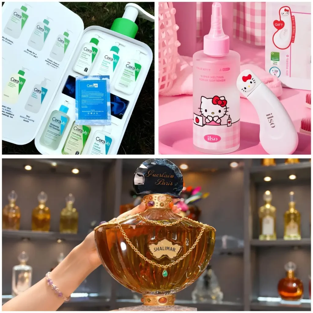
If raw aesthetics reduces consumption pressure through “imperfection,” then scarcity psychology enhances a product’s appeal by making it “not easy to obtain”—creating a sense of urgency that “this is your last chance,” thereby accelerating purchase decisions.
Scarcity psychology is a cognitive bias deeply rooted in human nature. Psychological research has shown that when an item is perceived as rare or difficult to acquire, people’s valuation of it increases significantly. This is because scarcity triggers two psychological mechanisms: one is loss aversion—the innate fear of missing out; the other is the desire for exclusivity—scarcity itself signals that “this is something worth competing for.”
In beauty packaging design, the application of scarcity psychology often takes the form of limited product batches—such as collaborative packaging, oversized product capacities, or brand anniversary editions. The scarcity of these limited products is reflected not only in the packaging design itself, but also in the limited production quantities and sales windows—further reinforcing the urgency of “once it’s gone, it’s gone.” This strategy encourages consumers to associate the product with a specific moment or event, adding emotional value to what might otherwise be an ordinary consumer good, while also creating more opportunities for brand-consumer interaction and word-of-mouth buzz.
That said, it is important to strike a balance when leveraging scarcity psychology. If limited editions are released too frequently, the sense of scarcity becomes diluted. If the messaging is not clear enough, consumers may not perceive the risk of “missing out.” This strategy is better suited to specific milestones in the product lifecycle—such as new product launches, seasonal campaigns, or anniversary commemorations—where clear time or quantity boundaries exist.
An effective scarcity strategy often naturally integrates scarcity with the brand story or product value—ensuring that consumers feel not just the “urgency of limitation,” but also that “owning it is a special choice.”
11. Custom Beauty Packaging With PAGpackaging
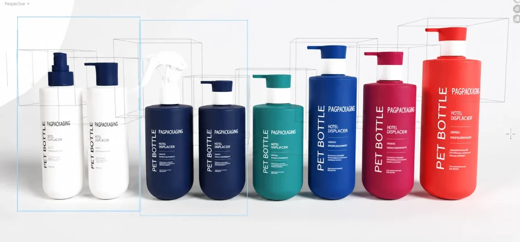
In a highly competitive market, packaging is not just the ‘outer layer’ of a product—it’s also an emotional bridge between brands and consumers. By understanding the psychological strategies behind beauty packaging design, brands can better attract their target audience and enhance their market competitiveness.
As a packaging factory with over 10 years of production experience, we not only deeply understand these design strategies but also excel at identifying the unique strengths of brands. With a portfolio of 300+ beauty packaging designs and extensive industry expertise, we can create customized packaging solutions that align with your brand image.
Additionally, our state-of-the-art facilities enable us to offer a variety of packaging design techniques, including silk printing, labeling, and hot stamping, ensuring that your packaging is both visually appealing and capable of conveying your brand’s value.
If you’re looking for beauty packaging solutions that can breathe new life into your brand, feel free to contact us. Let’s work together to create unforgettable packaging experiences for your brand!