Book Categories:

When choosing a haircare product, the first thing our eyes register is the array of colorful shampoo bottle designs on the shelf. As you browse, you’ll find that attractive bottles are everywhere—but what drives you to take a closer look and ultimately make a purchase is never just about “looking good.”
Great packaging design is essentially a coordinated expression of bottle structure and color strategy. Today, setting aside product fundamentals such as formulation and user reviews, we will take a purely design-strategy perspective to review several typical shampoo bottle styles on the market—and explore what kind of visual language those bottles we casually pick up and put down are using to quietly persuade us.
1. Unisex Design
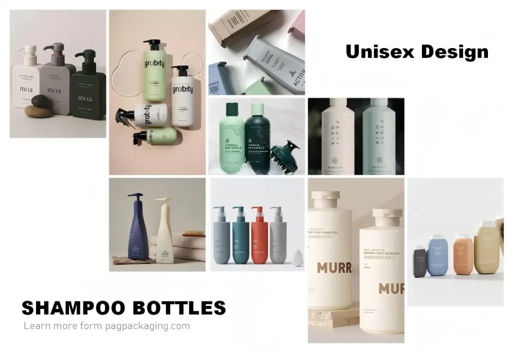
If you are conceptualizing shampoo bottle designs with a light-luxury positioning, a gender-neutral packaging design is well worth serious consideration. Interestingly, unisex (gender-neutral) design is hardly picky about bottle shapes—whether cylindrical, square, or irregular, it can rely on the power of color alone to convey a sense of understated sophistication.
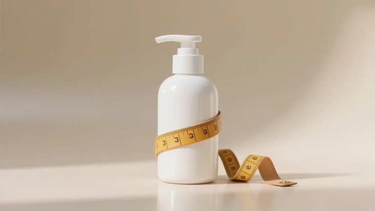
Beyond the classic black, white, and gray, low-saturation hues such as beige, navy blue, military green, and burgundy can also communicate a premium aesthetic. unisex design never shouts for attention, yet carries a gentle, quiet aloofness. More importantly, it possesses a near-universal spatial affinity—able to sit harmoniously alongside any color palette, without competing, yet leaving a lasting impression.
2. Masculine Design
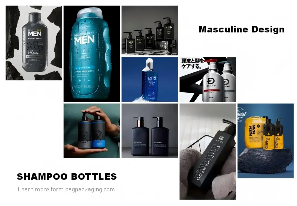
If the core strategy of gender-neutral design is to “set the tone with color,” then masculine hardcore shampoo bottle designs are coordinated expression of form and tactility. It actively departs from quiet understatement and instead employs sharp faceted surfaces, rough matte textures, and slightly aggressive geometric contours to construct a tangible sense of masculinity. Color steps into a secondary role here, with the bottle shape becoming the primary narrative language.
This is precisely why we most frequently encounter this design language in sports-oriented shampoos and men’s personal care products—sharp angles symbolize decisiveness, deep tones convey steadiness, and pops of vibrant color hint at the energy unleashed during physical activity. Color has not disappeared; it has merely been reassigned—it is no longer the tone-setter, but an auxiliary expression of strength.
If you are refining a product in the men’s shampoo space, this hardcore minimalist design strategy is well worth exploring in depth. It does not seek to appeal to everyone, but it enables the right audience to recognize themselves at a glance.
3. Dynamic Flow Design
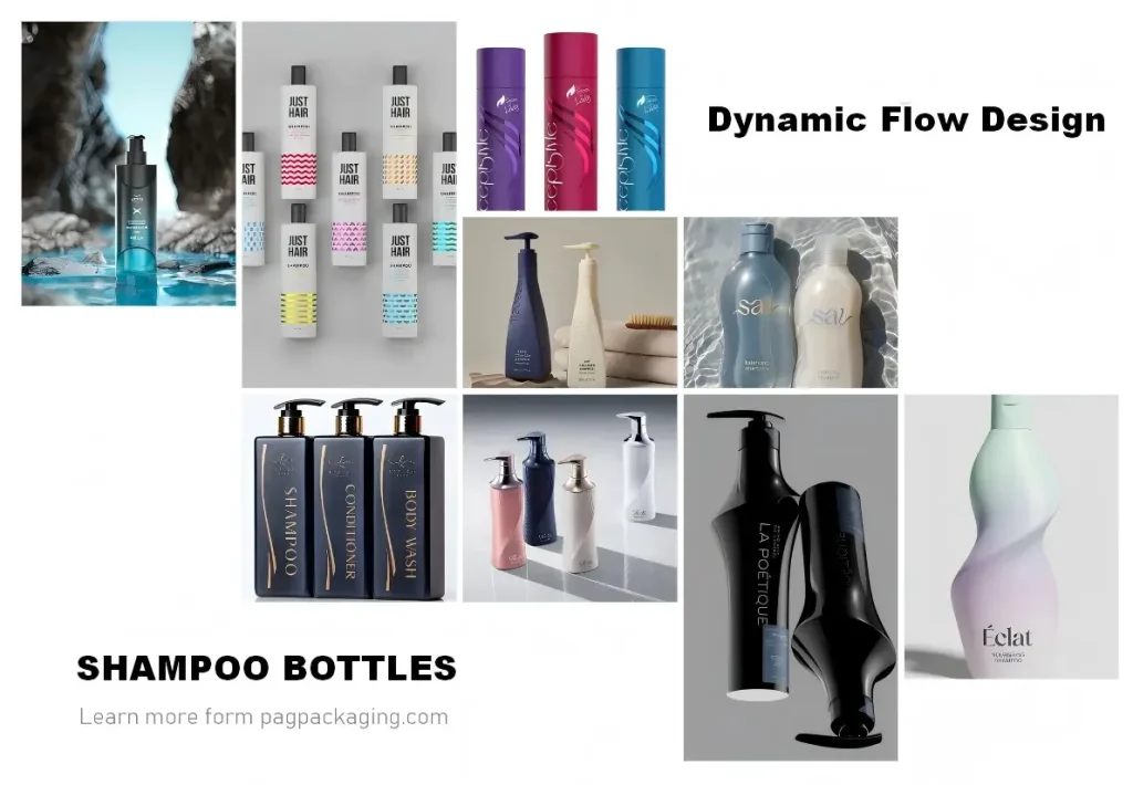
Unlike the previously discussed styles, each with their distinct visual statements, the dynamic flow design approach operates from a much more focused starting point—it revolves almost entirely around a single core motif: the streamline.
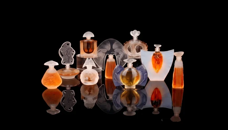
This motif draws inspiration from one of the most instinctive moments in the hair-washing process—the unconstrained, fluid trajectory of hair as it unfurls under the flow of water. Designers capture this fleeting moment and translate it onto the packaging through various process languages.
Some carve it into the bottle surface as undulating physical grooves, making tactile sensation part of the narrative; others depict it on labels, using flat graphics to convey the visual cue; still others apply it directly onto the bottle body through printing, establishing the connection with minimal intervention.
Yet regardless of the medium, the sinuous curves all point to the same goal: to make consumers subconsciously associate the notion of “smooth and silky” with the bottle in their hands during a brief moment of shelf browsing. This is the essence of the streamlined sculptural approach—it requires no complex storytelling. A single, simple visual symbol makes the product’s functional promise intuitive, tangible, and self-explanatory.
4. Biotech Style
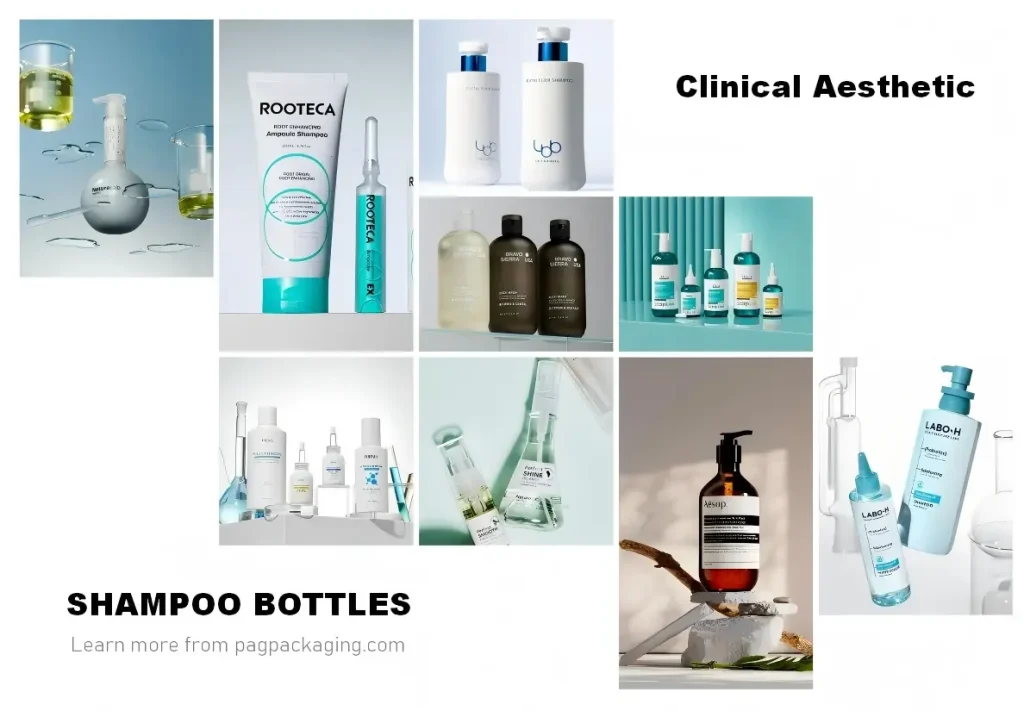
If you do not yet have a clear vision regarding color or bottle shape, yet still hope to establish a deeper connection with consumers on the shelf, biotech style design may be a direction worth considering.
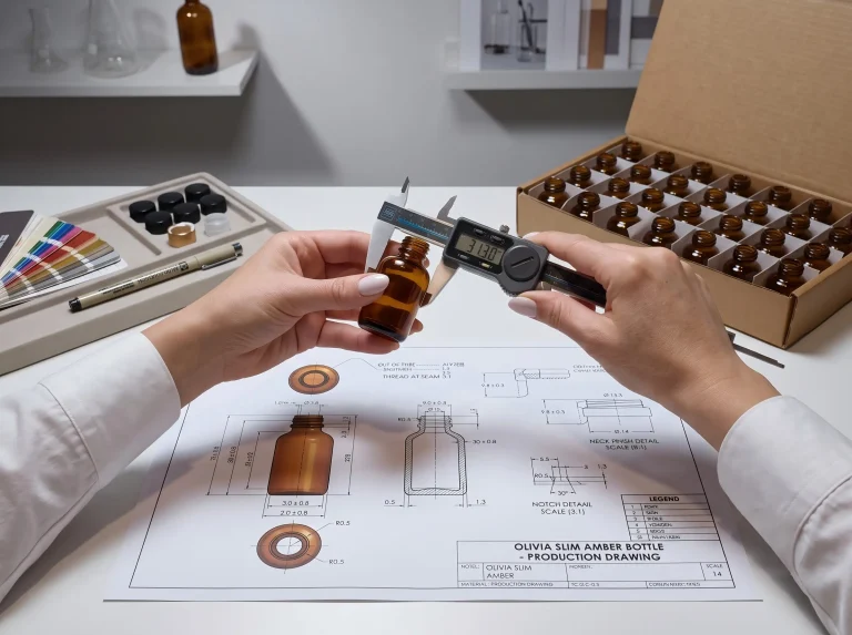
The color palette for this style typically revolves around tones closely associated with laboratory or pharmaceutical packaging—pure white, silver gray, deep brown, and warm orange. The bottle form also remains restrained, with few decorative or unconventional shapes. The visual focus is almost entirely placed on the printing details on the bottle surface—prescription-style measurement marks, slender and restrained sans-serif typefaces, and deliberately compressed information hierarchies—together forming a kind of quasi-medical visual order.
At first glance, this design seems to deliberately avoid emotional expression: no warm smiles, no vibrant colors, no promise of “making you beautiful.” Yet it is precisely this cool, unembellished calmness that evokes a deeper feeling within consumers—trust. It creates a sense of composed distance—neither flattering nor pandering, like a doctor in a white coat delivering a conclusion. And this “non-flattering” expression, in a market where packaging is often overwhelmingly “eager to please,” appears especially confident, even exuding a quiet sense of sophistication.
Behind this instinctive response lies our ingrained cultural memory of “medicalness”: white coats represent professionalism, pharmaceutical labels represent precision, and sophisticated instruments represent reliability. Clinical aesthetic shampoo bottle designs borrow these trust symbols embedded in our collective subconscious, automatically securing for themselves a “professional” endorsement on the shelf.
What is even more subtle about the biotech style is its subtle redefinition of consumer expectations. When a product’s packaging resembles a medicine or reagent bottle, consumers’ subconscious expectations shift from “clean hair” to “effective repair.” It makes the consumer feel that what they are buying is no longer just an everyday hair care product, but a precisely formulated scalp treatment regimen.
5. Modular Design
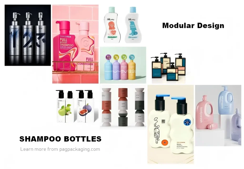
If your product line includes shampoo, conditioner, hair mask, scalp serum, and other multi-step treatments—and you emphasize that “every step is essential”—then modular designs can translate this product philosophy into a tangible visual language.
The core idea behind modular interconnected design revolves around a single key concept: relationship. It is not content with making each bottle look good on its own; rather, it seeks to establish a visual—and sometimes even physical—connection between bottles.
This connection can be achieved in two ways: one relies on printed graphics, where the lines and color blocks on three adjacent bottles happen to form a complete image when placed side by side; the other relies on the bottle form itself, where the concave and convex surfaces of neighboring bottles align perfectly to create a seamless physical fit. Whichever approach is adopted, the first impression modular shampoo bottle designs deliver to consumers is a sense of ritual. When three bottles—shampoo, conditioner, and hair mask—form a complete visual composition on the shelf, consumers subconsciously receive a psychological cue that “this is a complete system”—missing one just won’t do.
What is particularly clever about modular shampoo bottle designs are that it transforms “purchasing” from a standalone decision into a “collecting game”—once a consumer picks up the first bottle, they have already mentally reserved a spot for the second and third.
6. Dopamine Style
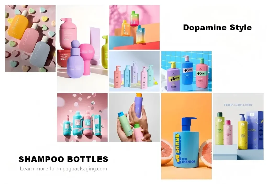
Last but not least, we come to the dopamine style.
In shampoo bottle designs, it stands almost in complete opposition to every other style mentioned earlier—gender-neutral is restrained, hardcore is sharp, experimental is cool, streamlined is poetic, while dopamine style revolves around a single core keyword: joy.
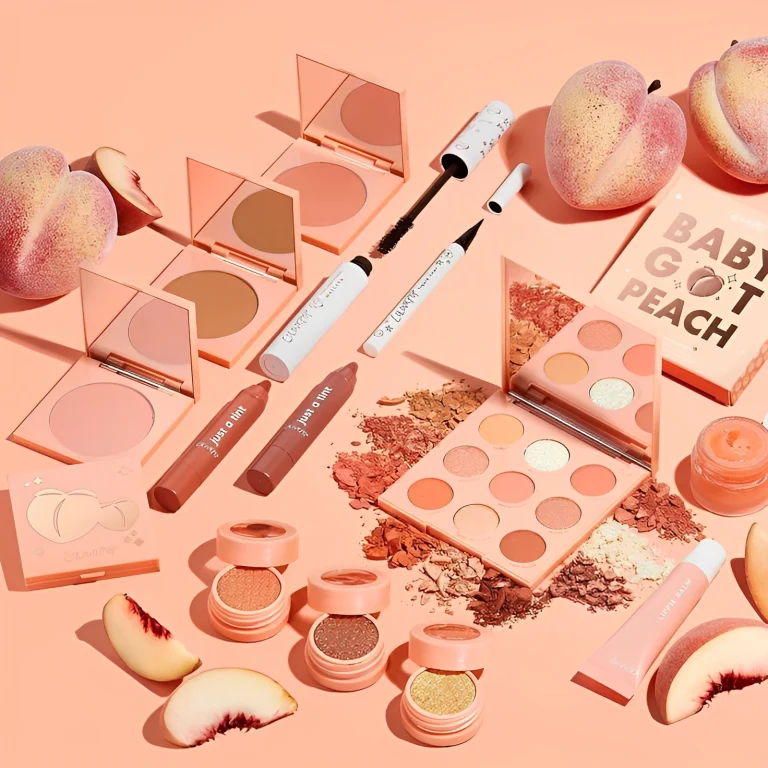
Dopamine-style shampoo bottle designs are impossible to overlook on any shelf. It does not aim for “timeless appeal”—it aims to “hit you at first sight.” High-saturation fluorescent pink, bright yellow, electric blue, neon green—these colors appear to have been spilled from a painter’s palette and freely combined across the bottle surface, sometimes in clashing contrasts, sometimes in gradients, sometimes in all-over pop patterns. It doesn’t require you to walk closer for a detailed look; from ten paces away, it has already sent a strong signal straight to your retina.
The underlying logic of this shampoo bottle designs are rooted in a precise psychological mechanism: color directly influences mood. Bright warm tones—orange, yellow, pink—subconsciously evoke associations with sunshine, fruit, candy, and amusement parks—all “happy symbols” deeply embedded in our memory. Consumers don’t even need to open the cap; just seeing the bottle delivers a micro-dose of emotional experience. And this experience shares a natural affinity with the shampoo category: washing your hair is itself one of the few moments of pure self-care in a busy day. A dopamine-style bottle feels like it has already set a cheerful background score for that moment.
That said, the dopamine style shampoo bottle designs come with a risk worth noting: there is only a fine line between high-saturation color and a cheap look. If the material and printing quality cannot support the vibrancy of the colors, the bottle can easily come across as a low-end novelty item rather than a joyful everyday essential. The number of color blocks, the proportion of each hue, and the transitions between colors all demand a high level of aesthetic control from the designer—too much and it becomes chaotic; too little and it feels flat. Here, we would suggest taking a closer look at brands such as b.fresh, Function of Beauty, and BYOMA for inspiration on their multi-color pairing techniques.
If your brand targets Gen Z consumers or follows the “joy-driven experience” trend in new consumer retail, then the dopamine style is definitely a card worth playing. It does not try to convince you that “this product is powerful”—it simply tells you: using it will make you happy. And in the shampoo category, “making people happy” is itself a function that should not be underestimated.
7. More Shampoo Bottle Designs
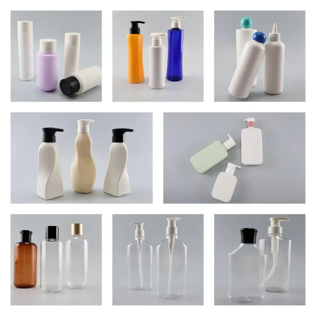
Of course, shampoo bottle designs are by no means limited to the six styles mentioned above. But no matter how the bottle shape evolves or how the colors are arranged, you will find that behind every design lies a specific brand posture—it can be restrained, vibrant, cool, poetic, orderly, or playful. Style is merely the surface; posture is the essence.
Most packaging suppliers on the market tend to specialize in only one or two of these stylistic approaches. At PAGpackaging, however, we want to offer you more possibilities.
As a manufacturer with over a decade of experience in the packaging industry, we maintain an extensive inventory of bottle mold options—from classic cylindrical bottles to crisp square bottles, and from curved bottles capable of accommodating fluid lines to virtually every shape imaginable for your hair care packaging needs. As the most direct visual carrier of shampoo products, we hope that our diverse range of bottle shapes and flexible design combinations can open up greater creative freedom for you, helping your brand posture find its most suitable vessel.
If you are looking for a hair care packaging solution—whether your ideas are clear or still taking shape, whether you already have a concept or are just beginning to explore—we welcome you to browse our bottle collection or simply reach out for a conversation. After all, great design doesn’t start with “drawing”—it starts with “talking.”